One Sass Color to Rule Them All
10 Jul 2014Have you ever gotten into the situation where you have a set of colors that are all quite similar, but you need each of them defined to create gradients, text shadows, borders, and the like?
For example, look at the following buttons. There are 3 variations of the button and each one uses a variety of different colors to control its look and feel.
Demo
See the Pen xsBuH by Elijah Manor (@elijahmanor) on CodePen.
Sample Code
You might even end up having some Sass that look something like the following. Does this look familar to anything in your codebase?
Reaction
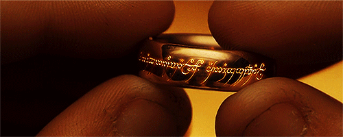
 If you are anything like Frodo, the sight of the above Sass code might have you shedding a tear or two yourself. However, don’t fear, there is a better way!
Refactor with a Mixin and 3 colors
Before we start addressing the color issue let’s first refactor the Sass so it’s moduldar. Step one will be to create a mixin to abstract the common set of Sass used in each button variation.
Our mixin will accept 3 color parameters that will serve as its base color, a darker color that will double as the border and a color-stop, and a third color that will be used for the text shadow.
Sample Code
Reaction

We can breath a little bit easier now that the repeated rules have been abstracted into a common Sass mixin.
The buttons are now the result of importing Button-theme(#006dcc, #085191, #031b30) for the primary button, Button-theme(#5bb75b, #4f904f, #2b4e2b) for the success button, and Button-theme(#da4f49, #bb3a35, #BB3A35) for the danger button.
Things are a little bit more organized, but let’s take a look at how we can make this even better and tackle the origional color issue.
Refactor with a Mixin and 1 color
I really like the idea of having one color to rule them all…
One Color to rule them all, One Color to find them, One Color to bring them all and in the darkness bind them
But in all seriousness, I’d rather not require 3 different colors for every new button variation we decide to add to our styleguide. Instead, I’d rather progrmatically figure out the color variations based on one base color, which is exactly what we are going to do.
The following mixin uses a combination of the darken and desaturate Sass functions to dynamically determine the other colors needed for our button. In addition to these functions, there are many other Sass functions that you can use to modify colors.
Sample Code
Reaction

The following buttons are the result of importing Button-theme(#006dcc) for the primary button, Button-theme(#5bb75b) for the success button, and Button-theme(#da4f49) for the danger button. The rest of the colors were determined during the Sass compilation process.
Demo
See the Pen pJKgD by Elijah Manor (@elijahmanor) on CodePen.
The result of the updated mixin is the same as we had before we started refactoring all this color madness. Win, win, win!